New Visual Identity Introduced as Part of SFMOMA Transformation
New Logo Featured on Exterior of New SFMOMA, Opening May 14, 2016
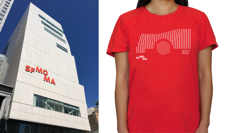
Photo: © Henrik Kam, courtesy SFMOMA. Photo: courtesy SFMOMA
SAN FRANCISCO (April 5, 2016)—The San Francisco Museum of Modern Art (SFMOMA) has created a new visual identity as part of its preparations for opening of its new museum on May 14, 2016. Similar to its Snøhetta-designed expansion, the new visual identity is designed to be porous, open and welcoming, providing multiple points of access. Like the design of its expansion, the museum’s new visual identity was inspired by the surrounding hills and the water and fog of the San Francisco Bay.
The museum elected to have its own Design Studio, led by SFMOMA Design Director Jennifer Sonderby, create the new identity. “SFMOMA has a long history of excellence in design,” said Neal Benezra, Helen and Charles Schwab Director at SFMOMA. “We feel it is important for the museum to be an active participant in the community of creatives we collect and exhibit, so we handed the assignment to the designers who know us best. The results beautifully reflect a deep knowledge of our organization and its goals.”
SFMOMA’s former logo—developed in-house by Catherine Mills in 1995—was informed by the geometry and solidity of the Mario Botta–designed building. The transformed museum now anchors a vibrant cultural district in the heart of the city. SFMOMA felt it was the right time to redesign the logo to better reflect the expanded institution, its new brand, and its relationship to its surroundings.
“SFMOMA’s goal to offer more access to modern and contemporary art was a catalyst for change throughout the institution,” explains Sonderby. “This translated into a new visual identity that literally opens up just as our building now does to the city, welcoming visitors for a wide variety of experiences.”
Logo and Color Palette
The letters of the new logo contract and expand, and their positioning and versatility aims to reflect diverse perspectives on and within the institution. On a functional level, the new logo is more space-efficient, allowing greater scale and legibility on everything from small digital screens to large street pole banners to the exterior of the museum. Echoing the contrast between the Botta-designed brick and the cool white façade of the Snøhetta expansion, the primary color palette of the new visual identity includes warm red, white and black.
Typeface
Two variations of typeface were custom designed to dialogue with the new logo: SFMOMA Display and SFMOMA Text. SFMOMA Display mimics the open shapes and curves of the letters within the new logo, distinguished by the splayed legs of its “M,” the lower counter of the “A,” a sleekly modern “Q” and the curvature of its capital “S.” SFMOMA Text elongates the letters, eliminating perfectly round circles to enhance readability, and provide the functional range necessary in order for the two typefaces to cover the wide range of needs of the institution.
Patterns
To celebrate the architectural joining of the original building and the new expansion, SFMOMA created graphic patterns combining the horizontal stripes of the Botta building’s iconic oculus and marble floors with the rippling lines of the Snøhetta building’s façade.
“This ever-changing pattern has become a metaphor for the way we see SFMOMA’s new visual identity, and a reflection of the museum itself. It is contemporary yet evocative of the past, dynamic yet easily legible, familiar but also surprising,” said Sonderby. “And this is only the beginning; we look forward to experimenting with and evolving this new graphic language as the museum grows and changes over time.”
Learn more about SFMOMA’s new visual identity:
https://www.sfmoma.org/read/story-new-visual-identity/
https://www.sfmoma.org/read/expand-contract-design…
https://openspace.sfmoma.org/2015/10/design-of-the-new-open-space/
https://www.sfmoma.org/watch/sfmomas-new-visual-id…