A More Accessible SFMOMA Font
An interview with Amy Yu Gray and Olivia King
June 2026In this interview, SFMOMA art director Amy Yu Gray and independent creative director and type designer Olivia King dive into the goals and decisions behind the redesign of the museum’s typeface for greater accessibility. This effort is part of a multiyear museumwide inclusive design initiative focused on making SFMOMA programs, practices, and communications more accessible and welcoming to all visitors.
Explore the San Francisco Museum of Modern Art's commitment to design and accessibility with its new typeface, SFMOMA Sans. This video details the evolution of their typography, addressing past challenges to create a unified, inclusive system. Discover how SFMOMA Sans enhances the experience of art and communication across its diverse collections and digital platforms.
What prompted SFMOMA to revisit its typeface?
AMY YU GRAY: Anniversaries are a time to celebrate, but they’re also an opportunity to reflect on what we’ve accomplished and where we can improve. The tenth anniversary of the Fisher Collection and the current SFMOMA brand identity, combined with the redesign of forty percent of our gallery spaces this year, felt like the right moment to evolve one of the most visible parts of our visitor experience.
Why did typography feel like an important place for the museum to invest in accessibility?
AYG: Typography is one of the most common touchpoints across the museum. It appears on everything from object labels and signage to our website and store products. When we evaluated our typeface for accessibility, we found that certain letterforms could create confusion, making it more difficult for people with low vision or conditions such as dyslexia to read. Our goal as a museum is to bring people closer to the art of our time. If we want to improve access, we need to remove barriers to understanding wherever we can.
How does typography influence the way visitors experience the museum?
AYG: On a practical level, typography affects how people navigate the museum and find their way around. On a more subjective level, typography communicates our values through its emotional qualities. It can say, “You belong here,” or it can say, “This isn’t for you.” One of the risks of the perfectly minimalist typefaces of the past is that they can sometimes feel cold or exclusionary. With the new SFMOMA Sans typeface that Olivia created, it connects us more clearly to our identity as a visual arts organization while also signaling a warmth that wasn’t as visible before.
What role does a font play in shaping a sense of welcome or belonging?
OLIVIA KING: A font has implicit meaning and feeling attached to it. Typography is a bit like a voice — you can almost hear how it sounds and how it shapes how information feels before we’ve even read it.
For SFMOMA Sans, we saw this as an opportunity to make something really approachable and friendly. We introduced softer curves, more open shapes, and subtle gestural details that make the type feel more human. The previous typeface was highly functional, but it was also more rigid and mechanical. This redesign was a chance to retain clarity while bringing more warmth and personality to the experience of reading.
What aspects of the original font system were most important to preserve?
AYG: It was important that we maintain some of the defining characteristics of our previous typography and logo systems. We have a long history with sans-serif typefaces, and we wanted to communicate stability and continuity as an anchor institution in the Bay Area.
We also preserved a wide range of weights because our designers rely on that flexibility across many kinds of projects. Our logo and architectural signage will continue to use our SFMOMA Display font throughout the building, so it was equally important that the new typeface pair well with it.
What makes a typeface more accessible?
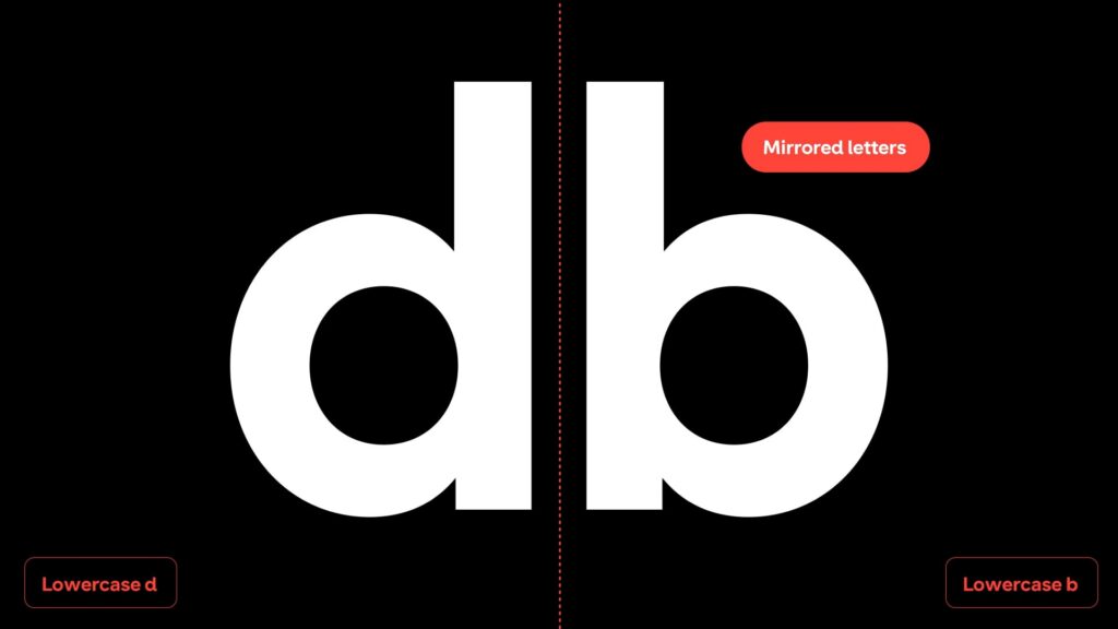
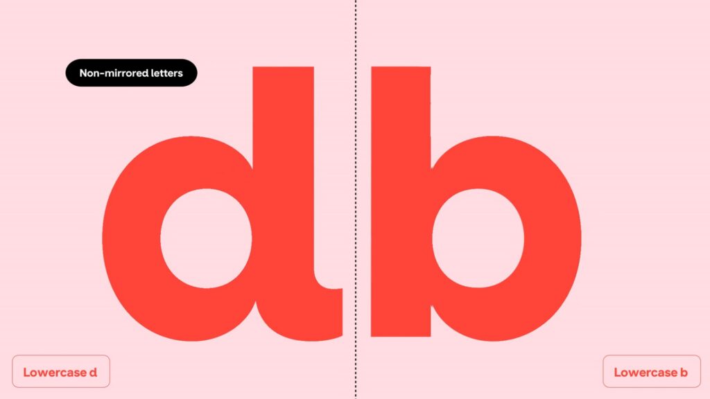
OK: At the character level, we’re trying to ensure that each letterform is easily distinguished from the others so there’s less opportunity for confusion. For example, ‘1’, ‘l’ and ‘I’ are all clearly differentiated, while pairs like ‘b’ and ‘d’ or ‘p’ and ‘q’ aren’t simply mirrored versions of one another.
As a system, accessibility is influenced by many small decisions working together. We’ve increased spacing between letters, adjusted proportions and x-height to improve legibility at smaller sizes, and designed more open counters to allow more light into each character. None of these decisions dramatically change the appearance of the typeface on their own, but together they make reading easier, more comfortable, and more reliable across a wide range of situations.
What research or testing informed your design decisions?
OK: Much of the work was informed by existing research into legibility and readability, particularly studies by Dr. Sofie Beier and her team in Denmark, alongside research from Microsoft and guidance from accessibility organizations. I was also able to draw on insights gained through the development and testing of Inclusive Sans, which has been used by millions of people around the world. [King worked on the design of the Inclusive Sans and Penguin typefaces.]
The initial accessibility audit of SFMOMA’s existing typography, undertaken by Prime Access Consulting, helped identify key opportunities for improvement and provided a clear framework for the project. From there, the process became highly iterative. We continually tested the typeface across digital interfaces, exhibition graphics, signage, and printed materials to ensure that design decisions worked not only in theory, but in the real contexts visitors encounter every day.
What changes did you make to SFMOMA’s typeface, and why?
OK: One of the biggest changes was bringing together what had previously been two separate typefaces: a Display font and a Text font.
The Display typeface carried much of the brand’s personality through its geometric forms and close relationship to the logo. The Text font, meanwhile, was more condensed and functional, but lacked some of the distinctive qualities that made the Display face feel uniquely SFMOMA. They served different purposes, but they also created a disconnect across the brand.
With SFMOMA Sans, we’ve unified these into a single type family that can work everywhere — from large exhibition headlines and wayfinding to website interfaces and body copy. The result is a more consistent and recognizable typographic voice across every touchpoint.
As mentioned earlier, another important change was introducing a greater sense of warmth and approachability.
Could you describe the process involved in creating the new SFMOMA font?
AYG: We began by identifying our high-level goals: improving clarity, particularly for audiences with visual or cognitive differences, while maintaining continuity with the SFMOMA brand.
Olivia listened deeply and responded with design directions informed by research into the SFMOMA archives. Once we aligned on a direction, she refined the work through an iterative process that gave us many opportunities to test the typeface in real-world applications and make adjustments along the way.
OK: I like to work as transparently and collaboratively as possible, so the process moved quickly from research and design directions into sketches and working prototypes. Rather than waiting until the end to see how something looked, we were constantly testing and refining as we went.
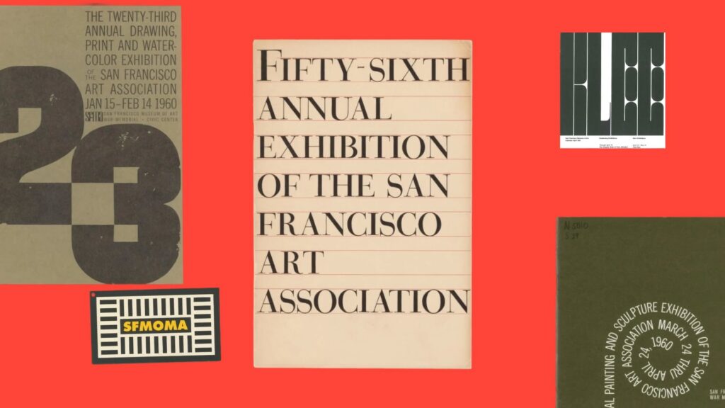
We also spent a lot of time looking further back into SFMOMA’s typographic history. Across decades of communications, exhibitions, and printed materials, there was a clear thread of geometric typefaces that helped define what feels inherently SFMOMA. Once we identified those recurring characteristics, we knew the new typeface needed to retain that DNA. This was very much about retaining familiarity and connection to history.
Once the overall direction was established, the technical work began. There were countless hours spent refining curves, spacing, proportions, and individual character details across nine weights. Typeface design is often about solving hundreds of tiny problems that most people never notice, but together those decisions create a system that feels effortless to read and use.
What part of the redesign are you most proud of?
AYG: Beyond being proud of the overall impact this project will have, I’m in love with our uppercase “Q” because it solves a problem of both form and function. At small sizes, our previous “Q” looked almost identical to the letter “O,” creating unnecessary cognitive load.
To get a little technical, the new tail crosses into the bowl of the letter, making it much more recognizable at small scales. While “Q” isn’t exactly a workhorse letter in the English language, this design solution imbues our typeface with a new expressiveness that says a lot about where we’re headed as an institution.
OK: I’m most proud of the balance we’ve managed to achieve between brand expression and accessible functionality.
Accessibility can add constraints, but constraints encourage creativity. Many decisions that improved readability also helped create a greater sense of warmth and friendliness. The typeface feels distinctly SFMOMA, but it also feels more human and approachable than before.
Where can audiences experience the typeface?
AYG: We soft-launched the typeface with Reimagined: The Fisher Collection at 10 in April and have been steadily introducing it across print materials and signage, including our redesigned visitor maps.
You can also see it on our website and social media channels. In a museum of our size, the rollout has necessarily been gradual because typography lives in so many different places.
How do you hope this work influences future design decisions across the institution?
AYG: I hope we continue to see inclusive design as an opportunity to better engage with our audiences. By making a conscious decision to lead with inclusion, we create momentum to continually improve our systems and experiences. I’m not interested in doing the bare minimum. We have a responsibility to design for all.
Why do accessible design choices often improve experiences for everyone — not only disabled audiences?
OK: Some of the most impactful innovations we use today, like the internet and email, originated from people designing for accessibility first.
Designing for the edge cases forces us to create solutions that are clearer, more intuitive, and more resilient. The same is true in typography. Features that improve readability for someone with a visual or cognitive difference often make reading easier and more comfortable for everyone else too.
What do you hope users notice — or perhaps don’t notice — about the redesign?
OK: They say the best typography is invisible, and I think there’s some truth to that here. I hope visitors find reading information throughout the museum and online more seamless and enjoyable without necessarily being aware of why.
At the same time, I hope there’s an underlying feeling of warmth and openness that comes through. If visitors feel welcomed, included, and able to engage more easily with the content, then the typeface is doing its job.
What does inclusive design mean to you personally?
OK: For me, inclusive design is about recognizing that there is no such thing as an average user. People bring different abilities, experiences, languages, backgrounds, and contexts to every interaction. Inclusive design is the practice of considering that diversity from the beginning rather than treating it as an afterthought.
As a type designer and creative director, that means creating systems that work for as many people as possible without sacrificing beauty, expression, or character. The most rewarding projects are the ones where accessibility and creativity strengthen one another, rather than being seen as competing goals.