What was it like to be a rock concert poster artist during San Francisco’s 1960s psychedelic music scene? In advance of the exhibition Art of Noise, Curator of Architecture + Design Joseph Becker interviewed artist Lee Conklin to hear his behind-the-scenes experiences. Thirty-one works by Conklin are on display in Art of Noise, on view May 4 through August 18, 2024, on Floor 7.
Joseph Becker: Can you tell me how you first got involved in designing psychedelic posters?
Lee Conklin: I can remember being five years old and being obsessed with drawing, so that’s where it comes from. In eighth grade, I got excited about lettering. My whole life, my self-image has been as an artist.
I got involved in the Fillmore shortly after I was released from active duty. Vietnam was just heating up, and I got lucky and was sent to Korea instead to be a cook. But they didn’t really need cooks, so I wound up painting murals on the mess hall walls there. It was as happy an Army story as I could have had, once I got out of basic training, which was the worst experience of my life. After that, I went back to being who I was.
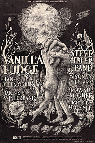
The first poster I did was for the band Vanilla Fudge, with the clasped hands growing out of bodies. How I got to the Fillmore was that my wife and I came to San Francisco. My intention was to find out how to be a poster artist, but I didn’t really have a clue how to make a poster, except for the ones that I did in college for campaigns and stuff. They were hand-drawn and totally different, and the mood was different, certainly.
I went over to Haight Street with my sketchbook under my arm to this poster store, The Print Mint. I showed the guy behind the desk what I had and said, “Where can I start?” He said, “Go see Bill Graham.” I knew that Bill Graham was the peak. That was what we were aiming for. I said, “You don’t understand. I don’t know anything about this.” He said, “Take that portfolio over to him. Do it today. Here’s his number. Get an appointment.” And that’s what I did. I went there with my little sketchbook of drawings, which included a drawing of the hands. Bill went through the book, didn’t say anything, and then came back to that page and said, “Can you make this into a poster by Monday?” This was Friday afternoon. And I said, “Yeah, sure.”
Fortunately, he was okay with me doing a black and white. That’s what I did because that’s all I knew. I finished it off with a black background and worked the lettering in around it. He gave me all the names and information that I had to put on it. I went home and said, “Guess what, Joy? I’m a poster artist.” And that’s where it started. I was able to get help from the printer, Lavonne Muscovian, and also from the people who did the photography and layout for the posters. They told me what I had to do to get colors on my poster. And I just kept going.
Becker: How did your designs evolve from that point?
Conklin: The first few were based on that drawing and the second one, which was The Who, was from another drawing I had. Bill said, “Yeah, can you make this one into a poster?” Which I did. And then the next thing that came up was the Cream poster — I did one and Stanley Mouse did one.
Bill gave me a photograph of the band to use, but I really couldn’t work with it, so I went to the corner store and got a music magazine, and there was a picture of Cream in it. And I used that. Turned out, Mouse used the same picture, but our posters looked very different, certainly.
I don’t remember if the next poster was the Moby Grape with all the spaces all over it. I may have had that drawing ready for Bill, too. I was able to talk him into letting me play with the lettering and I no longer had to show him a preview or illustration and was able to have quite a lot of freedom. An amazing amount of freedom, actually, for the time.
“There’s nothing I wanted to do more than impress people with my art and make them look — and keep looking and keep looking.”
Becker: At that point, you start getting really expressive with the letter forms, and some of the letters start to become almost bodily figures. Tell me more about that typography, it was such a new way of presenting text at the time.
Conklin: We were an alternative culture, and I wanted it to be alternative advertising, where the artwork took over. I wanted it to be art, too. Every poster after that, it was a new adventure. I didn’t want to repeat myself a whole lot, either.
When I got rolling, Graham was giving me two posters at a time. They always printed two posters at a time. It was an economy of scale. They’d print them on a big printer and cut them in half. Before, they had always used two different artists. We just had to check and make sure your colors and their colors could both be used on the same mix. It made it much simpler when I was doing both of them. For a while, I was the go-to guy. For that summer of ’68, he kept me very busy. My life was at the drawing board rather than out there being a hippie.
Becker: Were there bands you were keen to do a poster for?
Conklin: I would say I valued all of them. My radio was on the rock station, and I was learning a lot about music, or hearing a lot of music while I was working. The Grateful Dead came up quite often — that was a popular one — they were fine with me and they still are. I can still listen to them every day.
“For a while, I was the go-to guy. For that summer of ’68, he kept me very busy. My life was at the drawing board rather than out there being a hippie. “
Becker: Was there a point where you felt your typography was becoming too illegible?
Conklin: I don’t think that I got that complaint. By 1969, anyway, Bill was more worried about being offensive to the general public because he wanted to sell the posters on the backs of cereal boxes and stuff. That never happened, but I may have been just a little too far out there eventually for him. My career with Bill Graham ended abruptly when I did a poster for Albert King on one date, and the band It’s a Beautiful Day for a second date, but they both were on the same poster. Adding It’s a Beautiful Day was a change that Bill made the night before it was due. I had had it finished. I was really pleased. I was going to deliver it in the morning and I get this call, “No, we’ve got to change this.” And so, I worked all night to make the change.
To get paid, you had to go in person to get your $100, or I guess $200 for two posters. I’d been feeling economically abused and said, “I think I should have some overtime or something. I can’t tell you how hard it is to not only change all of that, but cut out all the overlays again, and I did it overnight.” And he sighed, which was very not like him. I mean, he was usually at full volume.
He pulled out his checkbook, wrote me a check for $50, and just dropped it on the table and that was the last time I got any work from him. That’s the way that ended in 1969. He had started using David Singer, who was easy for him to work with because none of his illustrations were too sexual, whereas I was pushing it all the time.
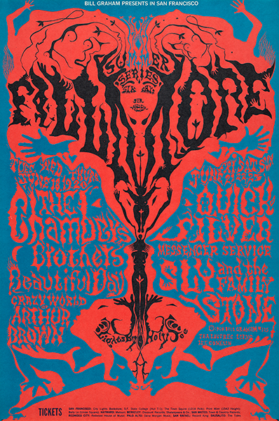
Becker: Some of your posters have incredible depth and intricacy. The Chambers Brothers and Quicksilver Messenger Service poster, each letter form is a world in itself, and now indicative of that whole moment in time.
Conklin: I felt like I was really rolling then. There’s nothing I wanted to do more than impress people with my art and make them look — and keep looking and keep looking.
Becker: Do you feel like you developed a relationship between the music and the aesthetics of that generation
Conklin: I wouldn’t give myself that much credit, but I was certainly affected by the music. It wasn’t like, “Oh, I’m translating the music. I’m getting this information out there.” I’m drawing an amusing picture and entertaining in its own right. I wouldn’t say any of my pictures were specifically for a group because that’s the way their music was. No, it’s just what I was doing that day.
Becker: Can you talk about the poster you did for Canned Heat and Gordon Lightfoot at Fillmore West
Conklin: It looks like a light show to me more than anything. That object at the bottom, I think it’s a toilet. It just happened that way. I didn’t always know what I was going to do next. I was sharing information about what was going to be playing at the Fillmore, and that poster reflected the light shows more than probably any other. [Almost all of these concerts had an artist doing projection lighting of swirling, blending psychedelic liquid inks.]
Becker: The light shows were often billed alongside the musicians, and yet they don’t get a tremendous amount of attention because they were pretty hard to capture. But your poster really captures it.
Conklin: For me, the visual experience at the concert was pretty important, as well as the musical. I just let it wash over me, when I made it to the shows. Mostly, I was working at my drawing table. I’ve always been sort of a loner. I never got to be buddies with any of the musicians. But of course I didn’t try. That’s probably the reason.
Becker: That’s interesting because there’s such a sense of communal energy around that moment in time.
Conklin: The world changed from the time I went into the Army and the time I came out in 1967. The word hippie, I didn’t know the word hippie. I was an East Coast boy, too. It was a powerful cultural experience to be thrown into that moment in time and get a chance to interpret it on my own.