Open Studio
Type Collage, Practice, and Patience
Boredom and Nuance
At first, this project is going to seem boring and tedious. And it is — at first. In fact most things are boring until you discover nuance and subtlety. Music, literature, sports — they are all basically the same thing repeated over and over. But once you learn that one player has a peculiar gracefulness, or one writer has an ear for teenage dialogue, or one filmmaker uses long stretches of silence to investigate time, you begin to appreciate the richness of the experience.
You also begin to understand the difference between things that “stand for” something and things that are those things. For example, you can draw a picture of a tree that looks like a typical tree, with all the typical tree parts in place. We see it and say “tree.” But you could also learn to draw lines on a page that seem to grow and branch and sway just like a tree. We see these lines and exclaim that they feel “alive like a tree.” It can take years of practice to get to that point, but that, in fact, is the point. It is simultaneously the simplest thing and the most difficult thing to do!
(I didn’t understand this at all until I returned to school later in life as a graduate student at Cranbrook Academy of Art. And even then it took two full years before I even began to figure this out. We are naturally praised when we learn to mimic something. It’s a difficult habit to break especially when our attempts to “think like the tree” are met with polite smiles rather than applause.)
Media:
Mixed Media
Materials:
- Some newspapers
- A magazine or two
- Maybe a copy of the Yellow Pages if no one minds you cutting it up (The Yellow Pages are still around even though most folks don’t use them. If you can find an extra copy stashed somewhere, it is a great, inexpensive (free, actually) treasure trove for type.)
- X-acto knife and extra blades
- Cutting board
- Roll of regular invisible tape
- A couple sheets of lightweight Bristol board (or something similar — heavyweight paper works well, too)
- A piece of flat plastic or vinyl that you don’t mind getting cut marks on (the cover of a vinyl notebook works well; that’s what I use)
Download This Activity
The Project
-
- Choose one page from the newspaper or a magazine that contains a lot of text. Using a photocopier or a scanner, make a few copies of the page, reduced or enlarged to various sizes. If the type in the original is small, it may be best to start the project with an enlarged copy of the page. If you use a scanner, choose a resolution that is high enough so the result doesn’t look pixelated when you print it out. I’d recommend 300 DPI at 100% of the size you want.
-
- Choose a single letter of the alphabet to focus on. The source doesn’t have to be English. If you can find another language to work with, it might make this project more surprising. Different languages use different letter combinations and sometimes different characters. Not being able to read the text can help you focus on the form.
-
- Find one of these letters in the page you’ve copied. Use the X-acto knife to cut it out and tape it down somewhere on the board. Don’t worry too much about where. It is alone in a room and can stand anywhere it wants. (The vinyl comes in handy here. I like to roll out a long strip of tape, tack it lightly to the surface, and then use my knife to lightly cut very small pieces of tape for each letter.)
-
- Cut out a second one of the same letter. You don’t know it yet but you are about to make one of the most important decisions of the entire project. The wonderful thing about working by hand is that there is no default; that is, the second letter won’t automatically line up with the first. So this new letter enters the room and has to decide where to stand (well, you are actually controlling the decision, but think of it as the letter’s choice). Is it a friend of the first one? A stranger? Will it stand close by? Perfectly aligned? A little tilted? Above or below? Every nuance is part of the story. Every detail matters. It’s incredible!
The “room” metaphor is just one of many. Choose one that you’re familiar with. Maybe the letters are a team on a field or performing in a circus or working in an office. The important thing to learn is not to make a “picture” of that thing, but to deeply understand what the letters would really do. It took me years to understand this, so be very patient. It helps to look at lots of art and ask yourself, what do these forms feel like they’re doing? (If you’re at SFMOMA, take a look at Martin Puryear’s brilliant sculpture or Agnes Martin’s paintings and ask yourself, what do these forms and lines actually seem to be doing — not just what they look like or remind you of.)
- Cut out a second one of the same letter. You don’t know it yet but you are about to make one of the most important decisions of the entire project. The wonderful thing about working by hand is that there is no default; that is, the second letter won’t automatically line up with the first. So this new letter enters the room and has to decide where to stand (well, you are actually controlling the decision, but think of it as the letter’s choice). Is it a friend of the first one? A stranger? Will it stand close by? Perfectly aligned? A little tilted? Above or below? Every nuance is part of the story. Every detail matters. It’s incredible!
-
- Repeat this for every one of the same letter that you find on the page. This will take time, but you will see the form of your work slowly take shape. And that’s a wonderful thing to witness.
I teach my students to work slowly. There is nothing to be gained by thinking this is a race. With every letter you put down, consider everything. Enjoy the options. They are much more plentiful than when working on a computer since the machine tends to force elements onto straight, exact lines. Even if you want to create letters (I do this all the time), by hand the lines will be slightly uneven because that is how our hands and eyes work. Take pleasure in these little chunks of humanity.
Please don’t cut out all the letters first and then rapidly assemble them on the page with big wads of tape. Not only will that end up a disaster if a breeze passes by, but you will miss all of the value of working slowly. Trust me on this.
- Repeat this for every one of the same letter that you find on the page. This will take time, but you will see the form of your work slowly take shape. And that’s a wonderful thing to witness.
-
- Now start paging through other materials to find more of the same letter. Magazines and other paper documents will have other forms of the same letter. Watch as these new intruders interact with the letters already on the page. (If you think you can handle it, consider the colors of type and paper in the Yellow Pages or in magazines.)
- When the time is right you can move on to a different letter. See what happens when a new group enters the scene. If you’re new to this work, consider making a series of small studies first, using one or two letters, before tackling something larger. This way you get a good feel for the time and craft involved.
Things to Keep in Mind
Your first attempts at this may not be very good or very convincing. Mine were horrid and looks silly and forced. The key is studying each effort, figuring out what is wrong and then doing it again. It helps to have a mentor — a friend, or relative or teacher who you can trust to work with you honestly and help you improve.
After you’ve done a number of these and are ready to move forward, consider creating your own rules to challenge yourself. Maybe you are looking for letter combinations, or maybe you develop more complicated scenarios to describe the relationships among the elements. You might start adding shapes or other small visual elements. Keep thinking about relationships and how these things react to each other.
Start studying crowds of people at events, in buildings, on buses, on sidewalks. Notice how people group together and spread apart, or how buildings and objects seem to form relationships on the street. Watch fish swim in a tank at the aquarium. Notice how clouds group together and move apart in the sky. All this material and insight is yours for the taking!
What I’ve Learned
Art is hard. So is design and craft. You have to be serious about it. You have to want to get better at it. And you have to practice and not be satisfied and practice some more.
You have to be wary of praise. When I was your age, my family and friends and teachers were my fans and cheered everything I made. I liked the applause. I rolled around in it and did tricks for more of it. I didn’t know the difference between being a trained animal and a serious student.
But I didn’t get better and the audience grew bored and I withered away for years. It took decades for me to understand that repetition is not advancement, and that you have to develop your own tough strategies for discipline, criticism, and practice.
Even art that looks simple and easy — well, especially art that looks simple and easy — if it is good, it has underneath it a lineage of practice and development, failures and restarts. If it doesn’t, it’s probably following a trend and you can ignore it.
I want so much to convince you that practice is itself pleasure and focus is joyful. Improvement and mastery are the greatest gifts you can give yourself.
Martin Venezky
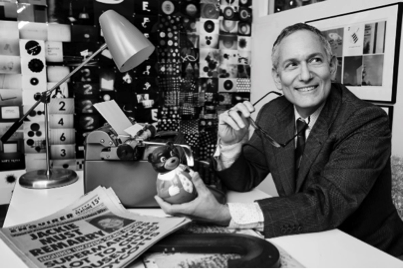
Martin Venezky; photo: Roger Erickson