The San Francisco Museum of Modern Art (SFMOMA) holds one of the deepest public collections of paintings, drawings, photographs, prints, and sculptures by Ellsworth Kelly (American, 1923–2015). A key figure in the development of American abstraction, Kelly was a celebrated colorist who had a keen eye for form. With the support of the Andrew W. Mellon Foundation in 2014, SFMOMA developed a cross-disciplinary team of curators, conservators, and Kelly scholars from within the museum and beyond to learn more about the works in our care. Topics of investigation included the artist’s favored processes and the best methods of display and preservation.1 Installing Kelly’s paintings may seem straightforward, but a critical refrain emerged within the team that there are two points of conception for these works: when they were painted and when they are hung.

Blue Green Black Red (1996, fig. 1) is one of the few paintings Kelly made on commission, and its creation is well documented. Correspondence between the artist and the collectors Doris and Donald Fisher shows how the work evolved from sketches and a collage. Detailed installation diagrams from Kelly’s studio reveal how he considered its placement in different spaces—at the corporate offices of the Fishers’ company, Gap Inc., in 1997 and at SFMOMA in 2010 and 2016. These materials make Blue Green Black Red an ideal case study to gain an understanding of the artist’s installation preferences.
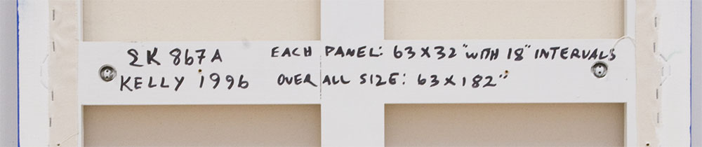
Kelly was acutely attuned to color, light, form, and architecture, and his attention to these details extended to the presentation of his work. Other artworks in a gallery could also affect his installation choices. Although he often included hang heights on the versos of his paintings—as well as interval spacing for multiple-panel compositions (see fig. 2)—these notations were intended to serve as guidelines rather than dicta. He acknowledged that many factors could influence the optimal placement of his work and that none could be considered in a vacuum.
Kelly created Blue Green Black Red as he was preparing for his 1997 retrospective exhibition at the Solomon R. Guggenheim Museum, New York. It recalls similar compositions made in 1965 and 1966, pivotal years for the artist as he explored the role of architecture in his work, with a specific focus on the visual and perceptual interplay between a painting and the wall.2 While Kelly considered past artworks such as these, he also kept in mind other works owned by the Fishers. An early proposal was refined because the artist felt its proportions too closely aligned with those of a print in their collection.3
Kelly tested ideas in drawing and collage before painting canvases. Two drawings visualize alternative sizes for the panels of Blue Green Black Red—64 x 32 inches and 72 x 30 inches—while a collage shows the 64 x 32–inch proportions in color. He often further tested scale with paper cutouts that he would hold closer to and then farther away from his eye in order to increase or decrease their perceived sizes in relation to his studio wall.4 The artist was careful to think about how visitors might experience his paintings—Blue Green Black Red, with the third and final canvas dimensions of 63 x 32 inches, is roughly human height, making it feel approachable. A person standing in front of a single panel is framed in color, the scale creating a harmonious dialogue between artwork and viewer.
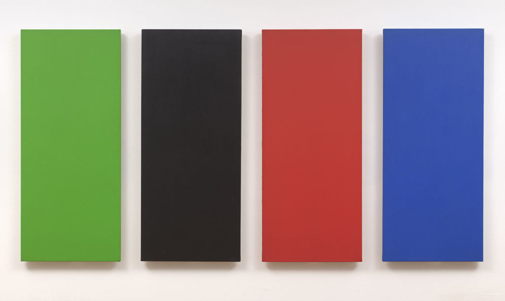
The title Blue Green Black Red identifies the order of the panels and emphasizes the artist’s nuanced understanding of color.5 The progression from cool to warm shades, interrupted by black, creates movement and tension. Kelly’s colors are always specific; he did not paint straight from a tube, and he was meticulous about how he mixed his oils in particular.6 He allowed each layer to dry completely before adding another, noting that black could take up to a month to cure fully.7 Although these four colors appear in other canvases, and even in other quartets, they are almost never identical. An acrylic painting at the Virginia Museum of Fine Arts, Richmond, Green Black Red Blue (1966, fig. 3), shows the impact of his choices of medium, sequence, and spacing.8 The hues in SFMOMA’s later oil work appear deeper and more vibrant—the difference in the blacks being especially noticeable—while the Virginia painting’s alternative ordering, which centers the warmest color, and its tighter interval spacing result in an arc of tension unlike Blue Green Black Red’s more linear trajectory from cool to warm.
Varnishes and lighting further complicate the values and interrelationships of the colors. In general, Kelly’s oil paintings reflect more light than his earlier acrylic compositions, yielding more visible brushwork.9 Varnishes can also add a gloss or matte sheen.10 Blue Green Black Red’s oil paint combined with its particular sealant place it on the glossier end of the spectrum. Lighting cannot be too strong or direct, as reflections will appear; Kelly tested various light sources throughout his career, including LEDs, and developed a general preference for those that produce something akin to natural light.11 Cool and warm colors respond differently to incandescent and fluorescent lights, and as most spaces do not include both, accentuating each color’s unique properties can be difficult. Kelly favored a full wash for gallery walls—the lighting at the top equal to that at the bottom.12 He wanted shadows present to enliven the paintings and to integrate them with the architecture.13
The edges of Blue Green Black Red are fully painted, a technique that the artist did not consistently employ.14 Displaying such work requires attention not only to the surface area but also to the full volume of each canvas, as this treatment affects the various viewing angles: When approached from the side, rectangular panels look like oblique parallelograms, and the impact of this slight perceptual shift, which adds both weight and depth, is enhanced when the edges are painted. The two installations Kelly initially tested for Blue Green Black Red demonstrated the outsize effects of ostensibly small adjustments in height and interval spacing (fig. 4).
4. Two configurations Kelly considered for Blue Green Black Red at the corporate offices of Gap Inc. Animation: Nick Roth, 2019. Artworks © Ellsworth Kelly
SFMOMA has shown Blue Green Black Red twice. In 2010, as part of Calder to Warhol: Introducing the Fisher Collection, the painting was displayed between two artworks that are much taller: Black Panel with White Curve I (1989, 99 1/2 x 86 1/2 inches overall) and Black Triangle with White (1976, 107 1/4 x 113 1/2 inches overall). The recommended hang height from the artist’s studio was thirty-six inches from the floor. By placing the panels at this level and centering them between the two other works, different aspects of the three paintings were accentuated—the arc of Black Panel with White Curve I, the verticality of Blue Green Black Red, and the swooping diagonal of Black Triangle with White.15 For the 2016 installation Approaching American Abstraction: The Fisher Collection, however, the curators and the artist opted for a lower hang height.16 There it was shown in a gallery with Wall (1958) and Blue Red (1966), a work that connects to the floor (fig. 5).17 Consequently, the 2010 presentation emphasized airiness, while the 2016 presentation felt more grounded.
5. Configurations of Blue Green Black Red at SFMOMA in 2010 and 2016, highlighting how different gallery spaces and contexts have impacted the hanging. Animation: Nick Roth, 2019. Artworks © Ellsworth Kelly
The artist also considered the height of the walls, the size of the reveals, the number and dimensions of the doorways, and the materials used for the flooring when he provided installation recommendations. His studio floor was constructed from warm pine planks, while the floor in the exhibition space he designed for his studio was concrete. This allowed him to assess how such settings could change a color experience.18 Kelly also paid attention to sight lines, noting when he wanted colors visible or when a black-and-white painting might provide a moment of respite, a neutral palette to help recalibrate the eye for more brightly hued artworks.19 Understanding how architecture and color work together was crucial for Kelly; he often cited Fernand Léger’s La femme en bleu (Woman in Blue, 1912) as a touchstone because of the way the painting activates “color in space.”20
Blue Green Black Red’s rich history offers a roadmap for future installations. Natural lighting creates the best environment for seeing the colors of Kelly’s varnished oil paintings while diminishing high sheens. Neutral white walls ensure that a painting’s colors present as closely as possible to what Kelly envisioned in his original studio conditions, while also providing a stark backdrop for shadows.21 The height and interval notations on the versos of the panels provide instructive starting points, but these measurements need to be adapted to the architecture of the gallery and the forms and dimensions of nearby compositions. Kelly’s multiple-panel paintings often benefit from larger interval spacings when shown in spacious galleries, though it is important to maintain the cohesive tension of the grouping. Lower hang heights are generally preferred when the compositions are shown near works that abut the floor. By studying past installations, we are able to honor Kelly’s eye and develop best practices for presentations of his paintings that take into account the architecture of the space, adjacent artworks, and lighting.
Notes
This essay was written under the auspices of the Andrew W. Mellon Foundation in support of SFMOMA’s Artist Initiative program.
- A major component of this study was a two-day colloquium that included curators, conservators, and specialists from Kelly’s studio. For details on the full scope of the Ellsworth Kelly Artist Initiative, see Robin Clark, “The Artist Initiative with Ellsworth Kelly,” San Francisco Museum of Modern Art, October 2015, https://www.sfmoma.org/read/artist-initiative-ellsworth-kelly/.
- For additional details about this period, see Gary Garrels, “Painting and Architecture,” in Ellsworth Kelly, ed. Tricia Y. Paik (New York: Phaidon, 2015), 323.
- Letter from Ellsworth Kelly to Donald Fisher, October 16, 1995, Ellsworth Kelly Studio Archives, Spencertown, New York. I extend my thanks to Eva Walters, Kelly’s former studio archivist, who unearthed this documentation.
- To read Kelly’s description of this process, see Ann Hindry, “Conversation with Ellsworth Kelly,” Artstudio 24 (Spring 1992): 26.
- Kelly studied the Munsell color system at the School of the Museum of Fine Arts, Boston. Albert Munsell identified three properties of color: hue, value, and chroma. For a detailed description of these properties in Kelly’s art, see Richard Shiff, “That Will Be That,” in Ellsworth Kelly, 193.
- The artist kept logs of his paint combinations. There are some extant jars of mixed paint at the Ellsworth Kelly Foundation, Spencertown, New York.
- Andrew M. Goldstein, “Ellsworth Kelly on His Singular Career, and the ‘Great Joy’ of His Art,” Artspace, December 29, 2015, https://www.artspace.com/magazine/interviews_features/qa/ellsworth-kelly-final-interview-53394.
- Nick Walters, Kelly’s longtime studio manager, commented that the artist tested acrylic paint because it dries more quickly. Ellsworth Kelly Colloquium, SFMOMA, December 3–4, 2014, Day 1, Session 2. Also of note, the original order of the Virginia panels was green, red, black, and then blue, per crossed-out inscriptions on the verso. The inscriptions additionally indicate that the interval spacing can range from four to ten inches, whereas the inscription on Blue Green Black Red specifies eighteen-inch intervals. The changes made to the Virginia work and its more flexible installation guidelines may be due to the fact that it was one of the artist’s earliest multiple-panel paintings, so he was just beginning to test how the order of the colors would affect the spacing.
- Another factor that contributes to the surface texture is the support. Kelly favored cotton duck over linen, which is often smoother, because it does not become as wet and droop with the weight of the paint. Ellsworth Kelly, interview with Gary Garrels and Sarah Roberts, July 2014, SFMOMA Painting and Sculpture Department files.
- Kelly experimented with a variety of varnishes. Blue Green Black Red is coated with butyl methacrylate polymer, while Green Black Red Blue is coated with a matte Liquitex medium. For a period the artist tried Golden MSA varnishes, but he found that the spray was sometimes visible and irreversible. Ellsworth Kelly Colloquium, Day 1, Session 2.
- James Bernstein and Nick Walters noted these factors. Ellsworth Kelly Colloquium, Day 1, Session 1. Walters specified that Kelly preferred LEDs in the 3,000-Kelvin range.
- Jack Shear provided this detail. Ellsworth Kelly Colloquium, Day 1, Session 1. Shear added that the color of the walls is equally important.
- Kelly had battens made to delineate how far a painting should float from the wall, further highlighting the importance he placed on shadow and a work’s relationship to the architecture.
- Though the treatment of edges varies throughout Kelly’s work, Yve-Alain Bois remarked that the edges of the multiple-panel monochromes made in France are consistently painted. Ellsworth Kelly Colloquium, Day 2, Session 1. This suggests that as Kelly developed his multiple-panel artworks, he considered their full volumes and how they would look from various angles.
- Gary Garrels, then Elise S. Haas Senior Curator of Painting and Sculpture, oversaw the 2010 presentation. It is important to note that the final installation deviated from the artist’s studio diagram: the three artworks were hung closer together, and Black Panel with White Curve I was lowered. Models can never perfectly capture an installation, and Kelly embraced fine-tuning in the actual space.
- Garrels and Sarah Roberts, then Andrew W. Mellon Associate Curator of Painting and Sculpture, oversaw the 2016 presentation. Placement was considered with the artist, but the installation was completed after he passed away. The display deviated slightly from Kelly’s diagram, with the paintings placed higher. The initial presentation included risers to help protect the artworks, but ultimately the museum was able to remove them.
- Green Red Yellow Blue (1966) is another four-panel artwork that has been hung closer to the floor in a gallery with Red Blue than in other presentations that did not emphasize the relationship to the ground. See the installation in Ellsworth Kelly: A Retrospective, Haus der Kunst, Munich, October 16, 1997–January 18, 1998.
- Eva Walters made this observation. Ellsworth Kelly Colloquium, Day 1, Session 1.
- Roberts shared this insight, based on a conversation she had with Kelly as the 2016 SFMOMA installation was being developed.
- Ellsworth Kelly in Hans Ulrich Obrist, Ellsworth Kelly: Thumbing through the Folder—A Dialogue on Art and Architecture with Hans Ulrich Obrist (Cologne: D.A.P., 2010), 18.
- Nick Walters noted that Kelly preferred Benjamin Moore’s Super White but that the name and the chemicals used to create it have changed over time. Ellsworth Kelly Colloquium, Day 1, Session 1.
 Photo: Liz Caruana